


MooMaa Cakes: A 48 Hour Branding Challenge
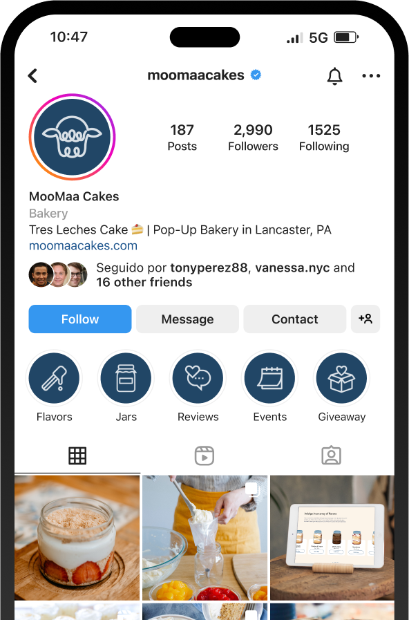
Moomaa Cakes emerged as Sweetfruit Studio's inaugural 48-hour Brand Kit project. Cristy's delightful tres-leches cake cups first made waves on social media. With a growing clientele in her local circle, the next step was evident - expanding her reach. When an opportunity knocked for Cristy to showcase her delectable treats at a community event, she turned to us. Our task? To craft a visual identity as enticing and authentic as her homemade desserts.
Client
MooMaa Cakes
Year
2020
Credits
Isaiah Sanabria - Art Direction, Visual Design
Kiwi Louis - Visual Design

We drew inspiration from the enchanting highland cows’ signature golden fringes, mirroring the creamy allure of tres leches' whipped topping. This concept seamlessly married the rustic beauty of the countryside with the velvety decadence of Cristy's creations, crystallizing the vision we had imagined for Moomaa.

The primary horizontal lockup and the secondary vertical lockup are designed for versatility, ensuring the brand's presence is optimized across diverse platforms. The use of Typo Round Regular typeface harmonizes seamlessly with the playful loops of the cow logo mark, enhancing recognition and brand consistency.

Primary Lockup (Horizontal)
Suitable for banners, documents, landing pages and other horizontal environments
Secondary Lockup (Vertical)
Suitable for most settings, center alignment, brand collateral

Only use the symbol in instances where the name is either used outside of the logo lockup (e.g.; social icons) or when the customer has become familiar with the brand (ie: in the toolbar of a website).
Establishing brand recognition for MooMaa’s new symbol will take time. It’s crucial for the brand’s success to have MooMaa’s name paired with its symbol for years and even decades to come.
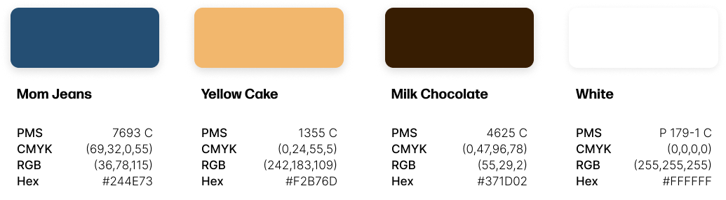
Crafting the mood for Moomaa meant blending fun, sophistication, and freshness. Drawing directly from the essence of the treats, the color choices of Mom Jeans (#244E73) and Yellow Cake (#F2B76D) emerged as the vibrant primary shades, encapsulating the brand's delightful spirit and charm.
Dive deeper into Moomaa's hues with our expanded palette. Handpicked for harmony, these tints and shades ensure cohesive branding across all materials. Each tone, whether subtle or bold, is purposefully chosen to enhance the brand's visual narrative.

Our color combinations are chosen for high contrast, ensuring legibility and accessibility at every touchpoint. While vibrant hues define our brand, black and white are reserved exclusively for mediums where color isn't feasible. This simplicity keeps the brand consistently engaging yet always user-friendly.

MooMaa's design aesthetics flow with waves and curves, which are harmoniously counteracted by using Roboto and Roboto Flex. In varying weights, these fonts anchor the brand with a straightforward and grounded ambiance, striking the perfect balance between playful dynamism and stable simplicity.


