


A Queer Gym Making Moves Online
Founded by River, Flow State Movement provides a safe environment for individuals, particularly those in the trans and queer community, to train with a responsible coach. Their vision emphasizes joint mobility as safety, conditioning as pleasure, and movement as liberation, highlighting movement as an act of self-love, autonomy, and agency.
The main goals of the project were to establish a cohesive and impactful visual identity that resonated with their audience, develop a user-friendly landing page that effectively communicated their services, and boost engagement and conversion rates.
Client
Flow State Movement
Year
2024
Credits
Sasha Kleiman - Creative Direction, Illustrations, Animations
Isaiah Sanabria - Art Direction, Visual Design
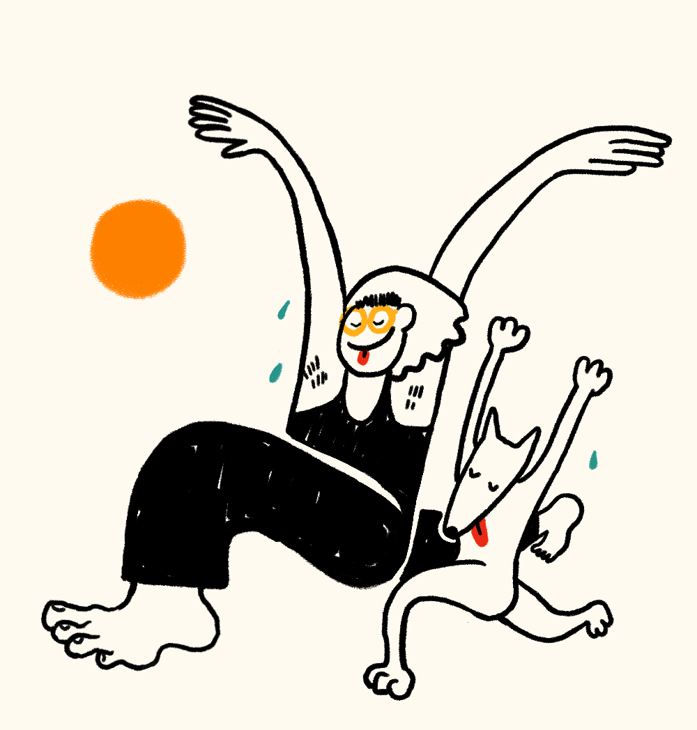
The initial ideas and concepts for the Flow State Movement project were inspired by River's personal preferences and existing branding, as well as our creative exploration, which included a nod to retro themes and 80s fitness clubs. River expressed a love for the sun, water, and waves, key themes to incorporate into the visual identity. Additionally, we aimed to infuse the design with whimsy to reflect River's queerness and sense of playfulness.
Starting with mood boards curated to capture the brand's essence, we drew inspiration from current design trends across various platforms. From there, River selected and approved a concept to move forward with. The chosen concept, "Sundrop and Roll," embraces relaxed, playful energy with flowing lines and vibrant tangerine hues, evoking the feeling of sliding into a downward dog beneath a summer sunset. This concept was refined based on feedback, incorporating elements from other mood boards to create a final design that resonated with the brand's identity and River's vision.


Several critical design decisions marked the evolution from concept to execution. We presented the color palette and mockups to the client with three distinct logo options, each reflecting elements from our initial mood boards. Ultimately, the client resonated most with the third option. This option exuded a modern yet retro vibe, accentuated by a vibrant orange sun detail. It featured the Movement variable font, a collaboration with Noel Pretorius, María Ramos, and contemporary South African dancer Andile Vellem.
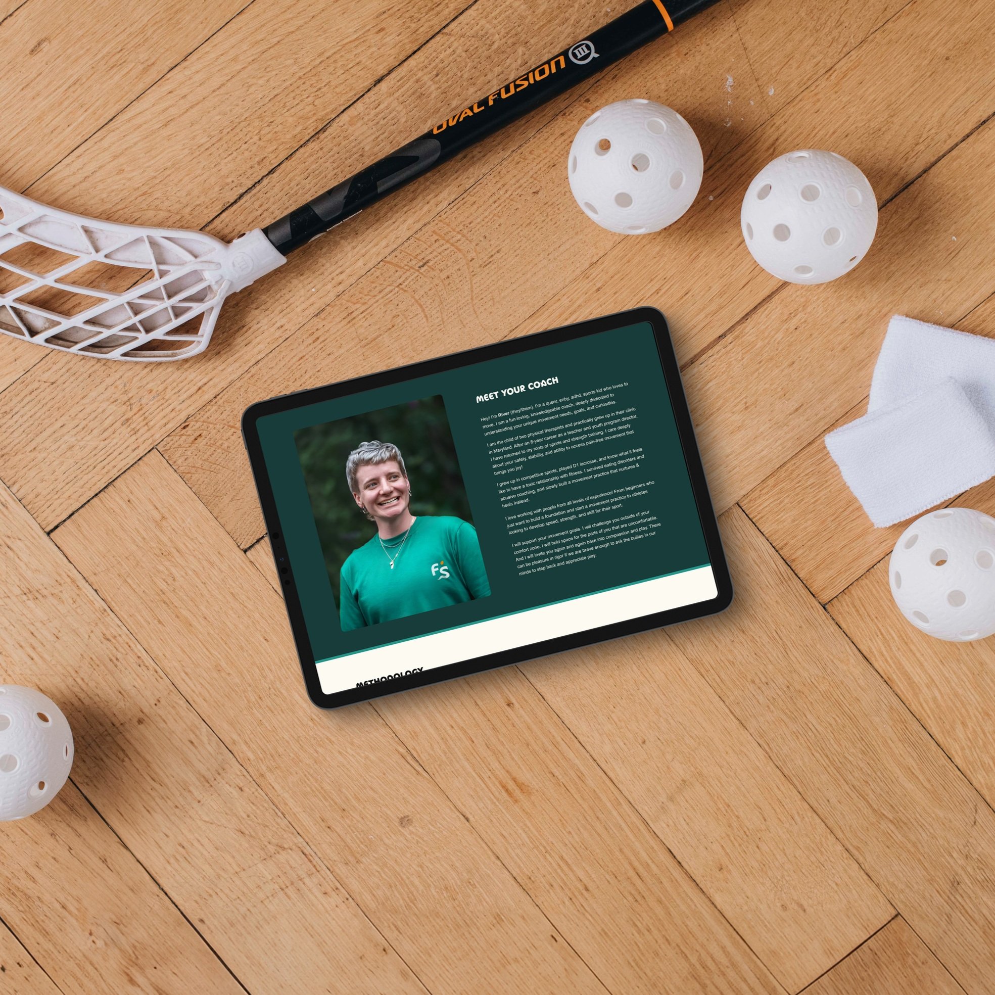
The web design process presented some challenges. The client's request for a single landing page required meticulous information architecture and a solid web strategy. We approached this by using storytelling to guide visitors through the website, ensuring they would be engaged and compelled to explore further. We utilized accordion formatting to streamline information presentation and incorporated interactive elements, such as animated illustrations on hover and a custom cursor resembling the brand's logo.
Reflecting on this process, condensing the information into a single page proved to be as challenging, if not more so, than spreading it across multiple pages. Going forward, I've learned the importance of having at least five pages for websites, as this allows for better organization and user engagement. Additionally, I now prioritize early communication with clients about the necessity of legal pages, such as Privacy Policy and Terms of Use, ensuring compliance and protection for their online presence.

We meticulously followed a comprehensive launch plan; a checklist outlining tasks for our design team and the client. This strategic approach ensured a seamless introduction to the new branding, minimizing the risk of overlooking crucial details during implementation.
Following the project's launch, we actively sought feedback from stakeholders and end-users to gauge the effectiveness of the new branding and website. This feedback was invaluable in refining and optimizing the project further, allowing us to address any remaining issues and enhance the overall user experience. By leveraging feedback loops and iterative improvements, we ensured that the Flow State Movement project continued to evolve and meet the needs of its audience long after its initial launch.


“Working with Sweetfruit Studio has been an absolute game-changer for my brand. From the very beginning, their incredible intake process made me feel seen and understood in ways I hadn't experienced before. They took the time to truly grasp the essence of my vision, which set the stage for an exceptional collaboration.
The creative genius emanating from their team of designers and illustrators is unmatched. Isaiah and Sasha not only brought my ideas to life but elevated them to a level of sophistication and brilliance that helped my brand shine like never before. Their attention to detail and commitment to excellence truly set them apart.
Throughout the process, I was struck by the emotional steadiness and accountability exhibited by the Sweetfruit Studios team. They provided unwavering support and guidance, ensuring that every step of the journey was met with clarity and purpose. This level of dedication is rare to find and made all the difference in my experience.
I must also commend their team's professionalism and timeliness in communication. Despite my busy schedule and start-up overwhelm, they ensured that our goals were met on time. Isaiah’s ability to navigate challenges and maintain a clear line of communication truly speaks to the caliber of service that Sweetfruit Studio provides.
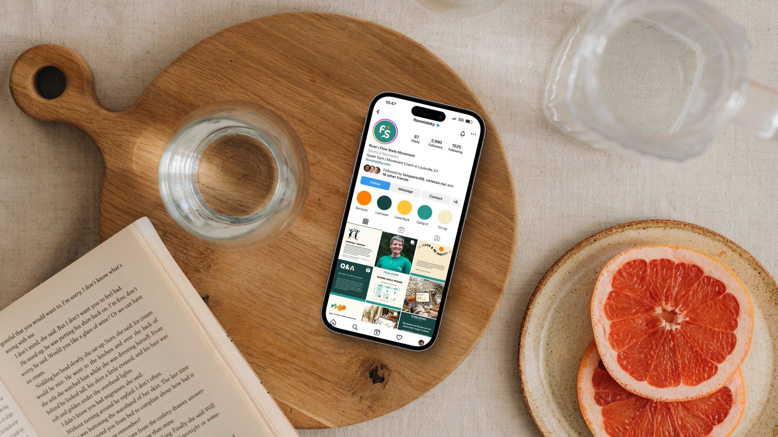
Flow State Movement has changed because of our work together. My voice and passions shine brighter than ever on my social media content and landing page. I am so excited for the future of our collaborations, the evolution of my work, and the reflection of that in the design Sweetfruit creates.
In conclusion, I cannot recommend Sweetfruit Studio enough. Their passion for their craft, coupled with their unwavering commitment to client satisfaction, makes them a force to be reckoned with in the industry. If you want to take your brand to new heights, look no further than Sweetfruit Studios.”